Abstract
Artificial Intelligence, and Machine Learning especially, are becoming increasingly foundational to our collective future. Recent developments around generative models such as ChatGPT, and DALL-E represent just the tip of the iceberg in new gadgets that will change the way we live our lives. Convolutional Neural Networks (CNNs) and Transformer models are at the heart of advancements in the autonomous vehicles and health care industries as well.
Yet these models, as impressive as they are, still make plenty of mistakes without justifying or explaining what aspects of the input or internal state, was responsible for the error. Often, the goal of automation is to increase throughput, processing as many tasks as possible in a short a period of time. For some use cases the cost of mistakes might be acceptable as long as production is increased above some set margin. However, in health care, autonomous vehicles, and financial applications, the cost of a mistake might have catastrophic consequences.
For this reason, industries where single mistakes can be costly are less enthusiastic about early AI adoption. The field of eXplainable AI (XAI) has attracted significant attention in recent years with the goal of producing algorithms that shed light into the decision-making process of neural networks. In this paper we show how robust vision pipelines can be built using XAI algorithms with the goal of producing automated watchdogs that actively monitor the decision-making process of neural networks for signs of mistakes or ambiguous data. We call these robust vision pipelines, squinting pipelines.
The research behind Squint Cognition
Introduction
Artificial Intelligence (AI) and Machine Learning (ML) especially, have become the de facto automation tools in recent years (Bachute & Javed, 2021; Mehditabrizi et al., 2023; Sarker, 2022). Deep neural networks of various architectures have risen to solve problems that were once thought intractable. For example, we use convolutional neural networks (CNNs) for advanced computer vision tasks such as image classification and object detection (Diwan et al., 2022; Krizhevsky et al., 2012). These models have proven to be helpful in automation tasks in different industries, e.g., manufacturing, agriculture, and security monitoring (Cui et al., 2018; Santosh et al., 2022; Sujee et al., 2021). In an assembly line, robots can be equipped with cameras and computer vision models to sort and assemble components, automating tasks that once required human involvement. Owing to these models’ ability to detect inconsistencies and deficiencies in products faster than human employees, automation is now possible in quality assurance departments (Peres et al., 2019). Even in the agriculture space, tractors and weeding robots are being equipped with AI models and computer vision pipelines to roam the fields and perform tasks autonomously (Fountas et al., 2020).
AI Research is also making progress in the automotive and self-driving domains. Companies like Tesla and Waymo are fielding car fleets capable of some degree of autonomy (Mit et al., 2020; Sun et al., 2020). Urban air mobility, civil aviation and the medical domains are also beginning to invest in this technology albeit with a heightened degree of caution (Bauranov & Rakas, 2021; Habibi et al., 2022; Wenger et al., 2022). The difference between industries that are quickly able to adopt new technologies and those which must tread more carefully lies in risk, and the ability to quantify those risks. The automotive, avionics, and medical domains are unique in that successful automation must consider the failure points of the technology. In other words, the value of a predictive model is not just in how much more it can increase production, it is also measured by how well we can explain its predictions, especially the mistakes (Onur et al., 2020). As an example, consider an algorithm that can identify signs of melanoma in a dataset of images from healthy patients, and patients suffering from cancer. This algorithm must be much more accurate and quicker than its human counterpart at assessing pathologies, however, this feat would be of little value if we cannot explain how the model arrived at its decisions. This is especially important in cases where the model makes mistakes. A diagnostics department at a hospital needs to understand the limitations of the models it is going to deploy in production, and to do so, it must be possible to explain the decision-making process of the model. We can argue that the same condition exists for achieving fully autonomous air and land vehicles.
Neural networks are often considered black boxes (Liang et al., 2021; Vanessa et al., 2021). This means that we can know the input into a neural network, and we can assess its output, but it is not clear how the output was derived from the input. It is for this reason that the field of eXplainable AI (XAI) has seen a rise in research activities in recent years. The aim of XAI is to provide tools and methodologies that shed light into the decision-making process of neural networks (Tjoa & Guan, 2021; Vilone & Longo, 2020). Thus far, the focus of XAI applications has been largely aimed at the development phase of machine learning models. XAI algorithms are seen in an auxiliary capacity where they help glean information about weaknesses in the neural network’s perceptive abilities, which can then be addressed during training to produce a more capable model (Holzinger et al., 2022; Xu et al., 2019). Relying on XAI methodologies to discover weaknesses in model perception and feature variability in the dataset is an important aspect of developing robust AI models, but we submit that in a similar manner to how we use XAI to identify dataset and model limitations in development, we can extend the scope of current XAI methodologies to evaluate differences in model state and latent space state during predictions leading to mistakes, and during predictions leading to correct answers. Thus, generating a list of mistake indicators that can be used in deployment to gauge the likelihood of a mistake in each prediction.
In this paper, we propose a shift in how we interpret the role of XAI. We propose that XAI methodologies are relevant beyond the development phase of a machine learning model, and are especially relevant during the production phase, where we define the production phase as the deployment of the model onto its intended use case. During the training phase of a model XAI can be used to improve the model’s capabilities (Weber et al., 2023), but regardless of how well trained the model is, mistakes are likely to occur during its deployment. There are a few reasons for this: most machine learning algorithms are frequentist models that learn to maximize the likelihood of the training data, this can lead to out of distribution samples causing mistakes in production (Berend et al., 2021; Lee, 2001). Another reason for mistakes is the nature of the data itself. In some cases, a sample may be ambiguous even to a human analyst. In general, there are regions in the data manifold that will always be difficult to partition (Paschali et al., 2018). In these regions where the data itself is ambiguous, high confidence predictions whether they are correct or wrong in the supervised sense, are equally problematic (Corbiere et al., 2019; Nguyen et al., 2015). These are regions where the information in the sample is not enough to determine the class of the image. Consider an image of a horse taken at a distance and under such lighting conditions that it might be confused with a large dog. Whether the model correctly identifies the image as a horse is irrelevant. It is our position that a vision model that is to be trusted should identify this region as ambiguous first, and offer the ML pipeline the option of trusting its own prediction or performing further analysis. In the medical use case, further analysis might involve a human doctor in the loop. In other cases, further analysis might involve invoking a more specialized model. The proposed approach extends the scope of XAI to identifying for each prediction, in deployment, when the prediction is likely to result in a mistake. The role of XAI is not to provide the correct answer, simply to indicate that a mistake has likely occurred. To correct the mistake our approach then suggests to employ a human in the loop or more specialized models and algorithms.
The rest of the paper is organized as follows. Section 2 provides a summary of state-of-the-art XAI algorithms, including notable recent surveys in the field. A description of the problem we are solving, and the nature of mistakes in model predictions is discussed in Section 3. An investigation of methodologies and methods together with promising results in relation to detecting model mistakes during production are reported in Section 4, as well as a description of the datasets used in these experiments. Finally, Section 5 provides the conclusion and a summary of the position we are presenting.
2. Section II
2.1. Literature review of XAI
The field of explainable XAI has produced a long list of algorithms and methodologies aimed at making the prediction process of neural networks more interpretable. Two recent surveys (Abhishek & Kamath, 2022; Vilone & Longo, 2020) separate these methodologies by use case and application fields, for example, computer vision, finance, and healthcare. Each use-case generally attracts a specific family of models depending on the nature of the available data (numerical, categorical, images, textual) and the task at hand (classification, regression). Similarly, depending on the problem being solved, the artificial intelligence model being employed might be Neural Networks, Support Vector Machines (SVM), Random Forests, or other similar models. Some XAI methodologies such as Anchors (Ribero et al., 2018) and Partition Aware Local Model (PALM) (Krishnan & Wu, 2017) are rule-based model agnostic methods. Rule-based approaches break down the problem of interpreting a model’s decision process into a set of sub-processes, where a researcher can evaluate each sub-process’ influence over the prediction. In practice, this breakdown of the prediction process into sub-processes is performed using decision trees.
Other XAI approaches are model-type-specific and produce explanations in the form of visual information, for example t-SNE (Coblentz et al., 2008), UMAP (McInnes et al., 2018), TriMap (Amid & Warmuth, 2020), PacMap (Wang et al., 2021). These models are used to generate a scatter plot of the internal representation of the training data in the model. The scatter plot is instrumental in understanding how well the neural network models capture the structural information in the data. t-SNE and PacMap are used extensively in this paper to identify mistake indicators useful in predicting errors at runtime, as discussed in Section 3.
Owing to the long list of algorithms available in the XAI domain, here we organize the ones relevant to our approach and offer an explanation on their differences, strengths and weaknesses. It should be noted that where our approach is specifically the use of XAI algorithms in identifying when a mistake has occurred in a production-time prediction, the algorithms we discuss here do not represent an exhaustive list of all algorithms that could be used to perform prediction monitoring, rather these are the algorithms that we have evaluated. Any algorithm that adds contextual information to a neural network prediction, and provides reasoning behind the prediction, is potentially useful in our approach. In Table 1 we present a list of XAI algorithms that we considered in our research. The algorithms are grouped by clustering vs saliency map generation methods. In our approach clustering algorithms provide contextual information when identifying mistake indicators by relating individual predictions to all the other predictions performed by a model during training. These methods provide a picture that is instrumental in creating our maps of trusted and ambiguous regions. The saliency map methods are useful to evaluate the quality of features resulting in correct predictions, and contrasting those with the quality of features resulting in mistakes, and generating rules based on those observations. The importance of identifying ambiguous regions, as discussed at length in sections III and IV goes beyond simply identifying mistakes. Ambiguous regions help identify areas in the model’s latent space manifold where more investigation may be required (either by involving a human-in-the-loop or more specialized algorithms) regardless of whether the prediction is a mistake or not. In this sense saliency map methods should not be used as a replacement for clustering methods, but rather to provide further analysis and possibly enhance mistake indicators identified through clustering methods. Based on our experiments and results we expect XAI integration to benefit use cases where the automation agent, e.g. neural network, suffers from low interpretability such that justifying an output is difficult given the input, and where the cost of mistakes can be paramount: health care, cancer detection, autonomous driving, autonomous take off and landing, financial applications, etc.
In the following subsections we describe the clustering and saliency map algorithms from the XAI domain that we used in our approach.
Table 1
We considered clustering and saliency map methods as candidate algorithms for identifying mistake indicators in model predictions. In this table we list the algorithms we used in our experiments, and the reasoning behind their use.
Clustering
algorithms
Used in our
reporting
Comments
t-SNE
Y
Used in our approach to visualize how mistakes are grouped within each data cluster. For each cluster we can visualize trusted regions where predictions are correct, and ambiguous regions where mistakes are concentrated.
SNE
–
Predates the t-SNE algorithms. We briefly investigated it but t-SNE provides better clustered representations.
PacMap
Y
Used in our approach in a similar manner to t-SNE, but where t-SNE fails to maintain global structure, or distance between clusters, PacMap maintains both local and global structure.
UMAP
–
UMAP and t-SNE both maintain local structure, but lose global structure information. t-SNE results in clusters that are much closer than they should be, and UMAP generates clusters that are too far apart. In the experiments we tried, t-SNE worked better at identifying ambiguous regions.
TriMap
–
Preserves global structures at the expense of local structures. We used PacMap in its stead.
Saliency maps
GradCam
Y
Generates saliency maps of input features using the gradient of the output with respect to layer activations. Does not provide contextual information of a given input and its relationship to other samples in the dataset, as clustering algorithms do, but provides insights into the quality of features involved in a prediction.
CAM
–
Predates GradCam. GradCam generates better saliency maps.
SuperPixel (Vilone & Longo, 2020)
–
Generates saliency maps, but more complicated to implement and less capable of generalizing than Grad-Cam. The performance is highly dependent on the chosen shape of the super-pixels.
Scroll the table sideways to see all columns.
2.2. t-SNE
The t-Distributed Stochastic Neighbor Embedding (t-SNE) algorithm is an improvement over the earlier Stochastic Neighbor Embedding (SNE) algorithm (Coblentz et al., 2008). t-SNE is a dimensionality reduction algorithm where a low-dimensional data distribution is made to approximate the high-dimensional distribution. This is achieved by converting the Euclidean distances between the datapoints in the high-dimensional data into similarity scores stated as conditional probabilities where the probability 𝑝𝑗|𝑖 is the probability that for two high dimensional data points 𝑥𝑖 and 𝑥𝑗, 𝑥𝑖 picks 𝑥𝑗 as a neighbor if the selection were done proportional to a probability density function centered at 𝑥𝑖.

Where 𝜎𝑖 is the variance of the Gaussian centered at 𝑥𝑖, Similarly, for the low-dimensional data, a conditional probability distribution is calculated as 𝑞𝑗|𝑖 to model a similarity score based on the pairwise distance between low dimensional points 𝑦𝑖 and 𝑦𝑗.

The goal of the algorithm is to minimize the KL divergence between the two distributions measured as:

The training process of the t-SNE algorithm forces 𝑞𝑖𝑗 = 𝑝𝑖𝑗. Algorithms UMAP, TriMap, and PacMAP are dimensionality reduction algorithms similar to t-SNE where the main trade-off is whether the local structure vs global structure of the high-dimensional data is preserved in the low-dimensional space. The PacMap algorithm produces a low-dimensional distribution where the local structure and global structure of the data is better preserved compared to the previous three algorithms: UMAP, TriMap, and t-SNE. PacMAp also does not require special hyper-parameter tuning.
2.3. PacMap
PacMap’s algorithm consists of three main parts: construction of a graph, initialization, and optimization using a custom loss function. The graph consists of neighbor pairs, mid-near pairs, and far pairs. The near-pair neighbors are defined by the scaled distance ∣∣𝑥𝑖−𝑥𝑗∣∣²𝜎𝑖𝑗where 𝜎𝑖𝑗 = 𝜎𝑖𝜎𝑗 and 𝜎𝑖 is the mean of the distances between 𝑖 and its Euclidean nearest fourth to sixth neighbors. Mid-near pairs are selected by sampling 6 observations and selecting the second closest as a pair with 𝑖. The total number of mid-near pairs to select is 𝑛𝑁𝐵 ∗ 𝑀𝑁𝑟𝑎𝑡𝑖𝑜 where 𝑛𝑁𝐵 is the number of nearest neighbors, and 𝑀𝑁𝑟𝑎𝑡𝑖𝑜 is set to a default value of 0.5. The number of non-neighbors to select (far pairs) is defined as 𝑛𝐹𝑃 ∗ 𝐹𝑃𝑟𝑎𝑡𝑖𝑜 where 𝑛𝐹𝑃 is the number of far pairs, and 𝐹𝑃𝑟𝑎𝑡𝑖𝑜 is set to a default value of 2. The loss function is:
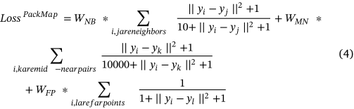
where, 𝑊𝑁𝐵 , 𝑊𝑀𝑁 , 𝑊𝐹𝑃 are weights initialized in stages: for the first 100 iterations of the learning process they are set to, 𝑊𝑁𝐵 =2, 𝑊𝑀𝑁 (𝑡) = 1000 ∗(1 − (𝑡−1)/100) + 3 ∗ (𝑡−1)/100, 𝑊𝐹𝑃= 1. For iterations 101 to 200, 𝑊𝑁𝐵 =3, 𝑊𝑀𝑁=3, 𝑊𝐹𝑃=1. For iterations 201 to 450 𝑊𝑁𝐵=1, 𝑊𝑀𝑁=0, 𝑊𝐹𝑃 =1.
2.4. Grad-CAM
Grad-Cam (Selvaraju et al., 2017) is a gradient-based algorithm that enables a researcher to calculate the gradient of a prediction with respect to the last layer of a neural network. A heatmap is then generated based on the gradient information and highlights the most salient features in an input image. These are the features responsible for the neural network’s prediction. More formally, Grad-Cam calculates an input saliency map using neuron importance weights 𝛼𝑐𝑘, where:
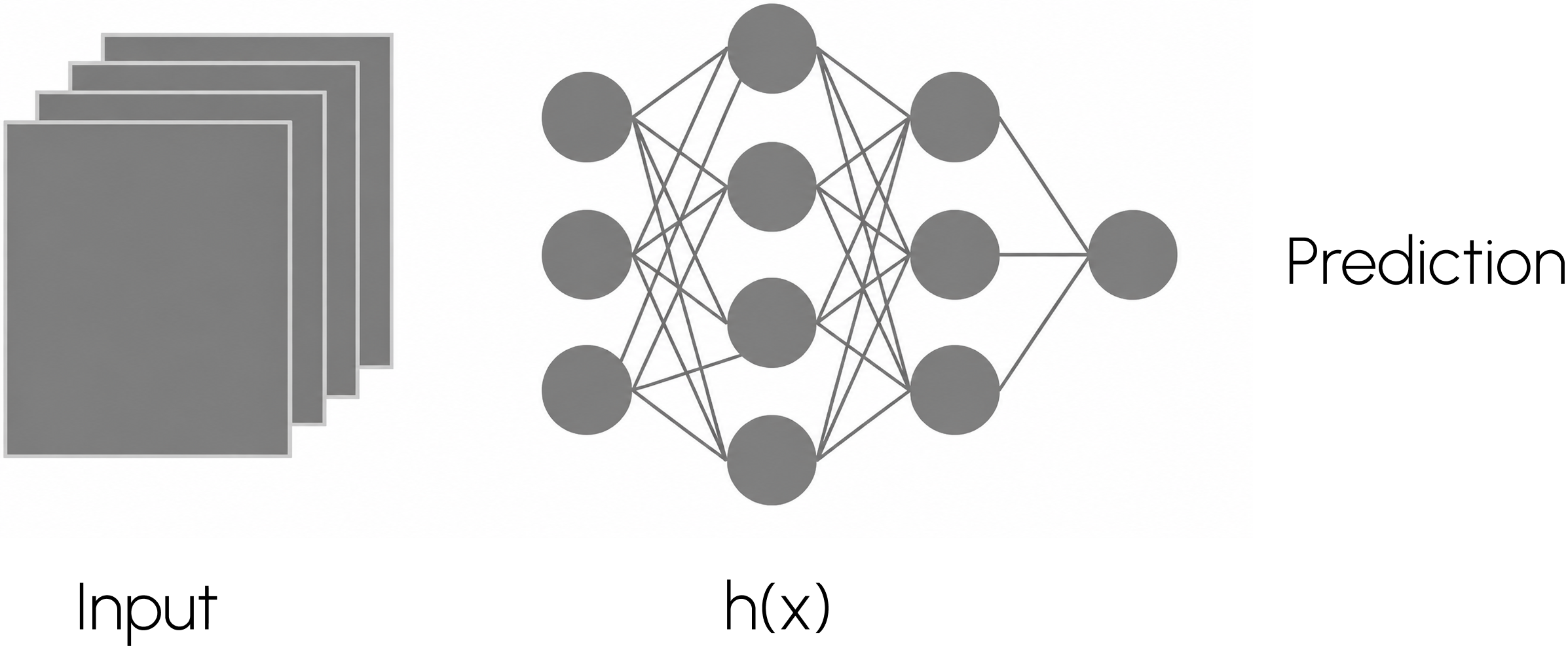
Fig. 1. A standard machine learning application consists of a trained vision model analyzing input data and producing an output prediction.

𝜕𝑦𝑐𝜕𝐴𝑘𝑖𝑗is the gradient of the output of class 𝑐(𝑦) with respect to feature map activation 𝐴K . The calculated gradients are global average pooled over the width and height dimensions (𝑖 and 𝑗) of the feature maps. The resulting neuron importance matrix 𝛼𝑐𝑘 can be further processed to generate a heatmap that when scaled to the size of the input image represents a saliency map of features contributing to the predicted output. As described in Section 3, we can use Grad-Cam to design mistake indicators as a set of heuristics, to alert us at production time that a prediction might be a mistake.
In this paper, we investigate XAI algorithms for vision neural networks, however, the purpose of the paper is to make the general claim that XAI methodologies can be considered and evaluated as tools for assessing models in production environments, as opposed to exclusively in the lab during model development.
3. Section III
3.1. Building robust production pipelines using XAI algorithms
Standard Machine Learning Application
The standard practice for developing a vision application is to train a neural network model ℎ(𝑥) on a dataset of training images from the problem domain and use it to produce a set of predictions over the input images, see Fig. 1. The neural network is adjusted and fine-tuned during the training process. At this stage, XAI algorithms are used to interpret what the model has learned during the training phase, and gauge how likely the model is to generalize in production. XAI algorithms such as t-SNE, UMAP, TriMap, and PacMap help visualize how well the neural network’s layers can learn latent representations of the data and visualize the latent vectors as clusters. The relationship between the clusters of different classes, and the relationship between the samples within each cluster helps gauge how well the neural network has learned to differentiate between the categories in the training data.
Other XAI algorithms like super pixel, and grad-cam help validate the quality of the features that the neural network has learned. Grad-Cam produces a heatmap highlighting the features in the input image that the neural network ‘‘looked at’’ to generate its predictions. Based on the findings from these XAI algorithms the neural network model, or dataset, are further fine tuned or augmented during the development phase of the model. For example, if Grad-Cam shows that the neural network is over emphasizing a type of background to predict the class of an object, such as predicting airplane because of the sky being prominent in the image, then the dataset is enhanced to include images of airplanes without the sky, to force the model to learn to focus on the airplane.
Once the model is updated and the best possible model is produced, the neural network is deployed in a vision application and used in production. During production, the output of the model is a distribution of probabilities. The application selects the highest probability in the distribution as the predicted classification for the input image, e.g in Fig. 2 the predicted class for the image is ‘‘Car’’. To protect against prediction mistakes, applications often apply a threshold before accepting a prediction. For example, only accepting predictions with higher than 80% confidence. However, a limitation of the threshold method is that high-confidence mistakes happen very often (Nguyen et al., 2015). In this paper we propose to use XAI algorithms during the production phase as an improvement over prediction thresholds for mistake reduction.
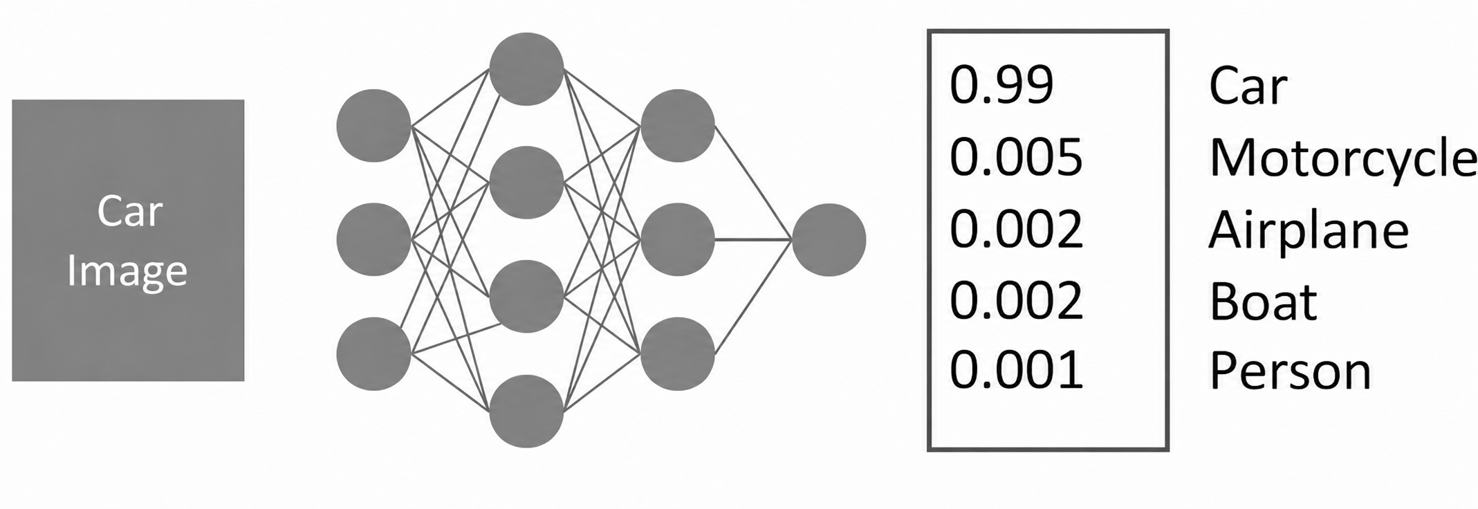
Fig. 2. Example of an image classification neural network outputting a probability distribution over a set of five possible categories. The image of the car is taken from the CIFAR-10 (Coblentz et al., 2008) data set.
Our Proposal: Squinting pipelines
During the development phase of a neural network model, we can use XAI algorithms to improve the training process as discussed in the ‘‘Standard Practice’’ section. But once the model is fully trained, XAI algorithms can be used to design a more robust vision pipeline as follows:
1. Identify mistake indicators: Identify a list of indicators for prediction mistakes using XAI algorithms such as t-SNE, PacMap, and GradCam. For example, identify regions in the latent representation where mistakes are clustered, and use the location of these regions in the 2D map of the data, as indicators of mistakes. Algorithms like Grad-Cam can be used to generate indicators of prediction mistakes based on the quality of features learned by the model, and gradient ranges associated with mistakes in the testing dataset.
2. Check predictions against mistake indicators: In production, the application evaluates each prediction against the known mistake indicators and decides when to trust the model’s prediction. For example, using t-SNE or PacMap, the application can project the latent representation of a production-time image onto the clusters of the training data. If the projection lands on one of the regions identified with a high density of mistakes, then the prediction of the model is not trusted. If the projection lands in an area of the clusters with no mistakes, or low incidence of mistakes, the prediction of the model is trusted. Similarly, using Grad-Cam the application can calculate the gradient of the prediction results with respect to the activations of the last layer of the model, and evaluate the gradient ranges against ranges associated with mistakes in the testing dataset.
3. Squint: When step #2 results in a model prediction not being trusted by the application, further analysis is required. If the use case permits, a human may be alerted at this point to classify the image. In medical use cases a doctor can be involved to verify the images that the vision application selects as problematic for the model to analyze. In use cases where full automation is required, instead of a human in the loop, a more specialized model may be involved to process the image.
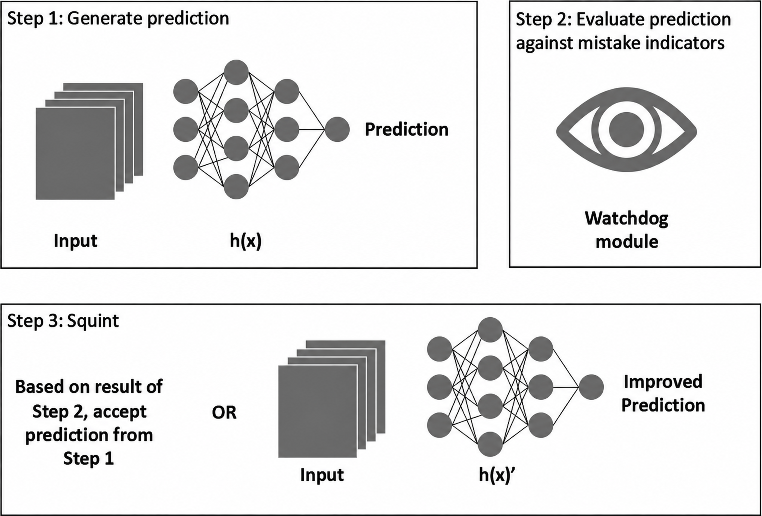
Fig. 3. A description of a squinting pipeline in production. Step 1 follows a standard application flow: a neural network analyses an input signal and produces a prediction. In step 2 a watchdog module analyses the prediction and latent representation of the input against a set of mistake indicators identified in the development phase. In step 3 the original prediction is accepted if there are no indications of mistakes for this prediction, OR the prediction is rejected and the input is passed to a squinting model for an improved prediction.
We call these specialized models squinting models. There are two categories of squinting models we can consider:
– Large models, more computationally expensive than ℎ(𝑥) which due to computational constraints cannot be the main vision model.
– Smaller models trained on a subset of the dataset. For example, if ℎ(𝑥) is trained on the cifar10 dataset to classify 10 categories of objects, and step #1 found a cluster of mistakes between the class 2 and class 3 images, a squinting model ℎ(𝑥)′ might can be trained to specifically differentiate between classes 2 and 3. Classifying between two classes is an easier problem than classifying between 10 different categories.
The squinting pipeline consists of a series of steps where the main model ℎ(𝑥) is used to evaluate an input and make a prediction, a second step where the prediction is evaluated against a list of mistake indicators, and a third step where the prediction of ℎ(𝑥) is either accepted or rejected, in which case a squinting model is used to re-evaluate the input, see Fig. 3.
4. Section IV
4.1. Dataset
For the methodologies and experiments described in this section, and the results reported in Section 5, we used the CIFAR10 dataset of natural images, and a breast cancer dataset (Mooney, 2023) consisting of biopsy scans of breast tissue.
CIFAR10:
The CIFAR10 training dataset consists of 50,000 natural images divided into 10 classes with each class containing 5000 images. The class labels are: [airplane, automobile, bird, cat, deer, dog, frog, horse, ship, truck]. The CIFAR10 testing dataset consists of 10,000 natural images also divided into 10 classes with each class containing 1000 images. The class labels of the testing set are the same as the training set. To train our models with the CIFAR10 dataset we performed the following standard random augmentations: Horizontal Flip, Horizontal Shift, Vertical Shift. The resolution of the images in this dataset is (32, 32, 3). Fig. 4 shows a sample of images in this dataset.
Breast Cancer Data:
The breast cancer training dataset consists of 126,056 images of breast tissue divided into positive and negative classes, where positive suggests the presence of cancer and negative suggests healthy tissue. The positive class has 62,901 samples and the negative class has 63,155 samples. The breast cancer testing dataset consists of 15,758 images with 7,947 images in the positive class and 7,811 images in the negative class. The resolution of the images in this dataset is (64, 64, 3). To train our models with the breast cancer dataset we performed the following standard random augmentations: horizontal flip, horizontal shift, vertical shift, zoom, rotation. Fig. 5 shows a sample of images from this dataset.
For both datasets the images were normalized before training and processing through our models. The normalization strategy used was the Min–Max scaling: 𝑋normalized = (𝑋−𝑚𝑖𝑛(𝑋))(𝑚𝑎𝑥(𝑋)−𝑚𝑖𝑛(𝑋))where 𝑋 is a pixel in the image, and 𝑚𝑎𝑥(𝑋) and 𝑚𝑖𝑛(𝑋) are calculated for the entire dataset.
4.2. Methodologies for discovering mistake indicators
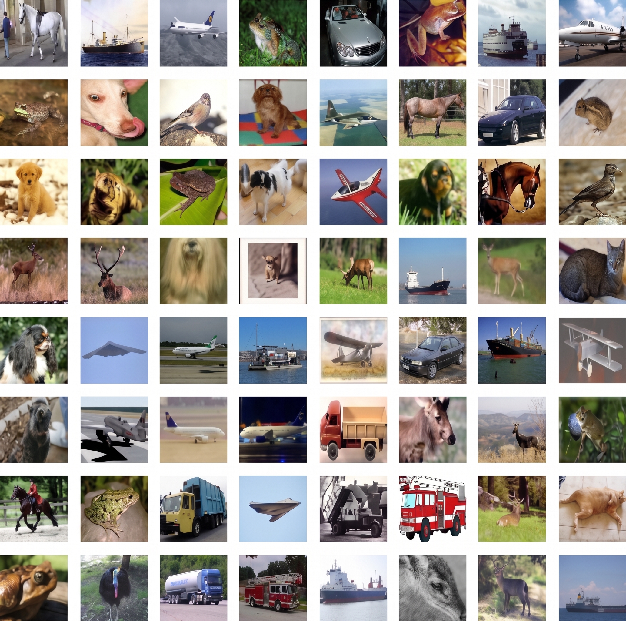
Fig. 4. Sample grid showing CIFAR10 images.
Consider the problem of estimating the probability of a mistake in a prediction. Consider an image 𝑋 of dimension 𝑤𝑥ℎ in pixels such that 𝑋 ∈ ℤ𝑤𝑥ℎ. Next, consider a neural network model ℎ(𝑥) which successfully classifies images of horses amongst a dataset of images of horses and dogs with probability 𝑃 (𝐻𝑜𝑟𝑠𝑒). Calculating the probability that ℎ(𝑥) makes a mistake classifying an image of a horse can be stated as 𝑃 (𝑀𝑖𝑠𝑡𝑎𝑘𝑒) = 1 − 𝑃 (𝐻𝑜𝑟𝑠𝑒). That is, the probability that ℎ(𝑥) incorrectly classifies the image of the horse is 1 minus the probability that it classifies it correctly. The problem with calculating 𝑃 (𝑀𝑖𝑠𝑡𝑎𝑘𝑒) in this manner is that it might work reasonably well for the whole distribution, but it is quite useless for a specific prediction. Our goal is to identify indicators in the decision-making process of ℎ that suggest that 𝑝(𝑀𝑖𝑠𝑡𝑎𝑘𝑒) > 𝑃 (𝑀𝑖𝑠𝑡𝑎𝑘𝑒), where 𝑝(𝑀𝑖𝑠𝑡𝑎𝑘𝑒) is the probability that the current prediction is a mistake, and 𝑃 (𝑀𝑖𝑠𝑡𝑎𝑘𝑒) is the probability of making a mistake over the entire dataset. That is, the probability that the current prediction is a mistake can be much higher than the probability of a mistake over the whole distribution. We want to discover indicators that suggest when 𝑝(𝑀𝑖𝑠𝑡𝑎𝑘𝑒) > 𝑃 (𝑀𝑖𝑠𝑡𝑎𝑘𝑒).
Let 𝑒 be the current prediction, e.g., e = Horse.
Let 𝑓 be the latent representation of input 𝑋 driving the current prediction.
Let 𝑝(𝑀𝑒) be the probability that the current prediction is a mistake. The probability that the current prediction is a mistake can be stated as the conditional probability of making a mistake given that the current prediction is Horse, and the neural network produced the latent representation 𝑓.

The amount of information in 𝑓 is limited in its ability to find indicators of a mistake considering the relation 𝑝(𝑀𝑖𝑠𝑡𝑎𝑘𝑒) = 1 − 𝑝(𝐻𝑜𝑟𝑠𝑒). If 𝑓 is not good enough to produce an accurate 𝑝(𝐻𝑜𝑟𝑠𝑒), we cannot expect 𝑝(𝑀𝑖𝑠𝑡𝑎𝑘𝑒) to be accurate. What we can do is to replace feature vector 𝑓 with a vector 𝐹 that contains information not present in 𝑓, and proceed to maximize the likelihood 𝑃 (𝑒, 𝐹 |𝑀𝑖𝑠𝑡𝑎𝑘𝑒). In the following sections we discuss methods for selecting vector 𝐹. In two approaches we rely on a combination of heuristics and the XAI algorithms: t-SNE, PacMap, and Grad-Cam.
It is important to note that Eq. (7) is the standard application of Bayes’ theorem. The problem we face in the machine learning domain is that modeling the prior distribution 𝑃 (𝑒, 𝑓) is intractable. This leads us to maximizing the likelihood 𝑃 (𝑒, 𝑓|𝑀𝑖𝑠𝑡𝑎𝑘𝑒). The result is that we cannot arrive at a true Bayesian learned distribution of probabilities over the predictions of a model, instead we arrive at a model that is constrained by the assumption that the data it will see in production is distributed exactly the same as the training dataset, which we know is often not the case . This constraint leads to exactly the types of mistakes that we aim to identify with the methodologies proposed in this paper. However, even if we were able to learn the true Bayesian probability distribution for a model’s predictions, the predictions would still be based on the logits in the final layer before the softmax, which through the compression process that happens as part a neural network’s forward pass it is missing potentially useful features (from earlier layers). The methods we propose, specifically the ability to generate maps of trusted and ambiguous regions is useful in that beyond just giving us a likelihood of a mistake, it provides more granular information in the form of similarity measurements between the latent representation of the input, and every other data point in the training dataset. We can use these similarity scores to glean information about what else the input might be showing (features which are no longer available in the final logits), e.g. a probability score might tells us that there is a 50% probability that the input is a car, and a 50% probability that the input is a truck, but a map of trusted and ambiguous regions can provide other circumstantial evidence that could suggest (based on features that were lost in the model’s predictions) whether the input is closer to car samples or truck samples, or samples from some other class.

Fig. 5. Sample grid showing images from the breast cancer dataset.
4.3. Heuristics-based approach to detecting mistake indicators in a neural network model using clustering algorithms
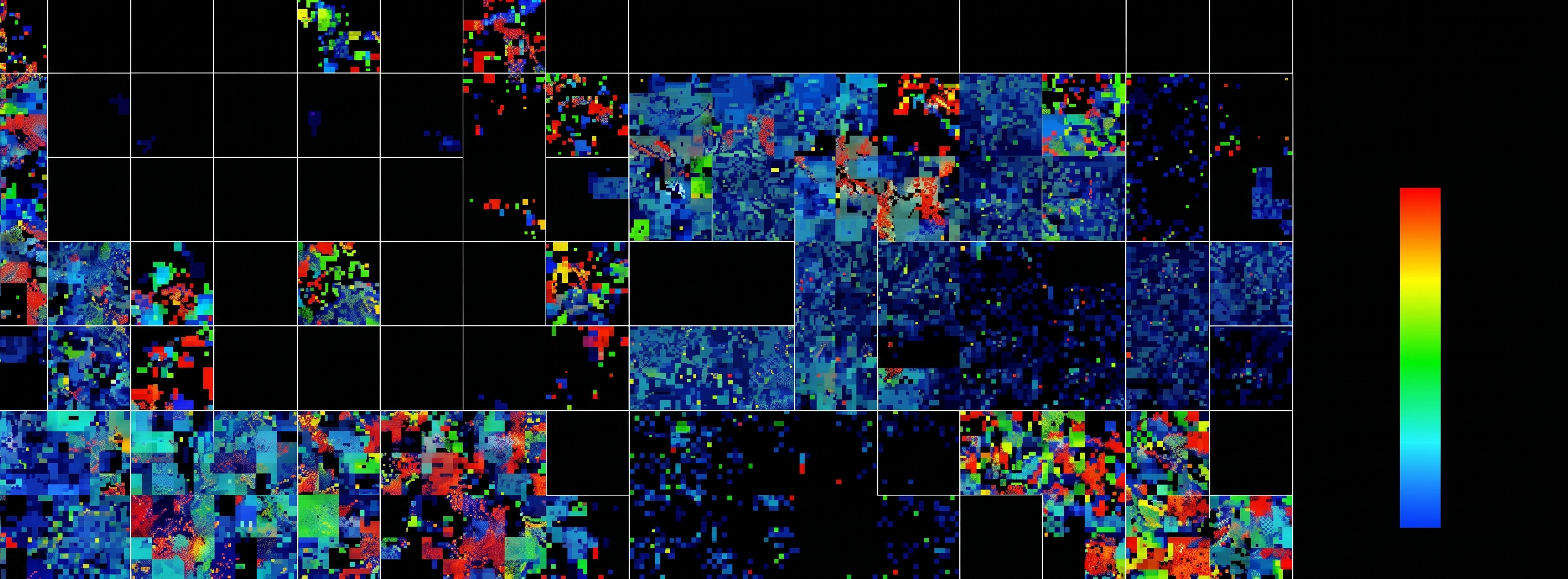
Given a neural network model ℎ(𝑥) with a per-class accuracy of 𝑃 (𝐶) and input sample 𝑋, we want a method that can tell us if the features, 𝑓, in the latent representation of 𝑋, are closer to the training data whose features are responsible for 𝑃 (𝐶), or if 𝑓 is closer to the features responsible for 1−𝑃 (𝐶). That is, we want to know if 𝑓 ∼ 𝐷(𝑃 (𝐶))𝑜𝑟𝑋 ∼ 𝐷(1 − 𝑃 (𝐶)). Our goal is to find similarities in the data for samples identified correctly, and similarities for samples resulting in mistakes. We can then use these similarities at production time as indicators that a prediction might result in a mistake. This can be done using a clustering algorithm such as t-SNE or PacMap to analyze ℎ(𝑥)’s internal representation of the training dataset. Both t-SNE and PacMap generate pairwise similarity scores between data points based on their Euclidean distances, as described in Section 2. The internal representation of a data sample in a neural network model tells us how the neural network sees the data. In our experiments, we selected the output of the flatten layer, 𝑓, of model ℎ(𝑥) since it represents the collection of features extracted from the input samples, just before the classification step. We then used a clustering algorithm to visualize the per-class relationship of the data in the training dataset. Next, we highlighted the samples in the clusters that resulted in mistakes during the training phase of ℎ(𝑥). This visualization gives us a clear indication of regions in the training data where ℎ(𝑥) is prone to mistakes. That is, by visualizing the mistakes amongst the clusters we can generate a set of heuristics on 𝐷(𝑃 (𝐶)) where 𝑝(𝑀𝑖𝑠𝑡𝑎𝑘𝑒𝑠) > 𝑃 (𝑀𝑖𝑠𝑡𝑎𝑘𝑒𝑠). Using this information, it is possible to create rules identifying regions in the cluster topology that are likely to result in mistakes, see Fig. 6 and Fig. 7. We can then include these rules in a production-time module that checks a model’s prediction at runtime against the rules, indicating when the prediction is likely to result in a mistake.
Furthermore, we have empirically seen through testing this approach on sample datasets such as MNIST (LeCun, 1998), CIFAR10 (Krizhevsky & Hinton, 2009), ImageNet (Deng et al., 2009), and a medical Breast Histopathology dataset (Mooney, 2023), that regions prone to mistakes are often regions where different classes overlap such that the samples in these regions are structurally closer to each other than they are to their respective classes, see the highlighted regions in Figs. 7 and 8. These figures show that mistakes tend to cluster in specific regions of the data clusters. The top panels of Figs. 7 and 8 show mistakes in the training data for the cifar10 and breast cancer datasets respectively, while the figures in the bottom panels show testing mistakes projected onto the training datasets. These figures show that it is possible to use regions where mistakes cluster in the training data as indicators for possible mistakes in production. This hypothesis is validated by the mistakes from the testing data being clustered around the same region as the training mistakes. The location of these regions in the 2D map that is the cluster plot can be used as indicators of possible mistakes at runtime.
We can further generalize that regions where data between clusters overlap in the latent representation, see Fig. 9, are good candidates for further analysis as possible areas of mistakes by the model, regardless of if these regions show a high incidence of mistakes in the testing datasets. The reason for this is that these are regions where the data itself is ambiguous and the correct prediction may have been produced by selecting a reduced number of features that are not indicative of success in production. Consider a dataset of images belonging to classes 𝐴 and 𝐵, see Fig. 10, where images at the center of the 𝐴 cluster and images at the center of the 𝐵 cluster are unambiguous examples of each class, and images at the shared edge between the two clusters might be ambiguous examples where features overlap between the two classes. Clustering algorithms are not always great at preserving global structures so the ambiguity regions must be checked and not assumed. We can create two sets of vector representations [𝑍𝑎1, 𝑍𝑎2, ⋅, 𝑍𝑎𝑛] and [𝑍𝑏1, 𝑍𝑏2, ⋅, 𝑍𝑏𝑛], produced by inferencing input samples from the center of the clusters A and B through the neural network ℎ(𝑥). Next, we can create two sets of vector representations [𝑍′𝑎1, 𝑍′𝑎2, ⋅, 𝑍′𝑎𝑛] and [𝑍′𝑏1, 𝑍′𝑏2, ⋅, 𝑍′𝑏𝑛] produced from images at the edge where the two clusters overlap. Then we can measure a similarity score between the two sets [𝑍′𝑎] and [𝑍′𝑏] using Euclidean distances as performed by t-SNE and PacMap, and compare the score against the similarity between [𝑍𝑎], [𝑍′𝑎] and [𝑍𝑏], [𝑍′𝑏]. Regions in the clusters where the samples from classes 𝐴 and 𝐵 are more similar than they are to their respective 𝐴 and 𝐵 samples should be suspected regardless of the incidence of mistakes in the testing data, an example of this is region 𝐴𝐵 where both clusters overlap.

Fig. 6. Cluster of the latent representation of the MNIST training data. The samples in black are cases where the true label of the image is 7, but the neural network predicted something else.
4.4. Heuristics based approach for detecting mistake indicators in a model using gradient-based methods
Clustering methods provide an understanding of how the model sees the data and the relationship among the data samples as captured by the model. However, clustering algorithms do not tell us what the model looked at while making predictions. In the computer vision use-case, this means that we cannot tell what portions of the input image the model considered in its decisions. For this, the XAI subfield of machine learning has developed algorithms that shed some light into what features of the input image the neural network considered most important for its prediction. Grad-Cam is one such algorithm that we have investigated in the context of analyzing a model’s performance against a training dataset, with the objective of identifying indicators in the decision-making process that suggest when a prediction has a high likelihood of being a mistake.
The Grad-Cam algorithm works by calculating the gradient of an output with respect to the activations of any specific layer. The gradient information tells us how small changes in the activations of a particular layer affects the predicted output. These activations represent maps of important features extracted from the input image. Grad-Cam tells us that we can use the gradient of the output of the model with respect to any feature map, of any layer, to generate a heatmap that visualizes which features in the feature map are most relevant to the prediction for this layer. We can then analyze the gradients to find patterns for when the model makes mistakes vs cases when the predictions are correct. These patterns serve as indicators of mistakes that a machine learning pipeline can use at runtime to gauge when a prediction can be trusted and when a prediction is likely to result in a mistake. The heuristics we have investigated with success on the cifar10, and breast cancer datasets were designed as follows:
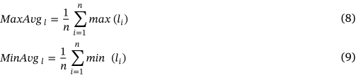
Where 𝑀𝑎𝑥𝐴𝑣𝑔𝑙 and 𝑀𝑖𝑛𝐴𝑣𝑔𝑙 refer to the mean of the maximum and minimum gradient values (calculated as the gradient of the model’s output with respect to the activations of each layer 𝑙 in the model) for all layers in the model, respectively. We can then identify a range of maximum and minimum gradient values that are correlated with prediction mistakes and create a rule for detecting mistakes at production time. An example of a rule is:

That is, if the gradient values fall within a range [𝑡ℎ1, 𝑡ℎ2] that is identified empirically as being correlated with mistakes, then we consider the current prediction to be likely a mistake. The intuition for this rule is that since these gradient values are an indication of how much weight each individual feature map in each layer contributes to the final output, it is conceivable that mistakes happen in areas where the model either over values or under values certain features. This would be reflected in the overall magnitude of the gradients.
.svg)

Fig. 7. This image shows a cluster graph of the CIFAR-10 training data on the top panel, and the CIFAR-10 testing data on the bottom panel. On the top panel, the regions highlighted with a white perimeter shows an area of high density of mistakes in the training data. Importantly, the testing data also shows a region of high density of mistakes around the same perimeter, such that if the perimeter identified with the training data is used as an indicator of possible mistakes, most of the mistakes in the testing dataset are identified.
The second heuristics we investigated using the Grad-Cam method is computed using Eqs. (11) and (12), where 𝐴𝑣𝑔𝑁𝑜𝑟𝑚 is calculated as the average of the normalized heatmap values for each layer, and the heatmap reflects the weight of each feature map for each layer as defined by Selvaraju et al. (2017). 𝑁𝑜𝑟𝑚𝐴𝑣𝑔 is the normalized average of heatmap values for all layers. The effect of 𝐴𝑣𝑔𝑁𝑜𝑟𝑚 is to produce a heatmap that contains important features collected by each layer, whereas 𝑁𝑜𝑟𝑚𝐴𝑣𝑔 represents the most salient features in the prediction. This is because without normalizing the heatmaps of each layer individually, the average of heatmaps is heavily outweighed by the contributions of the last layer, see Fig. 11. We then generated the following rule for identifying mistakes.

The intuition for the rule is that often there are important features captured in the early layers of a model that are lost by the compression and do not make their way into the last layer, see Fig. 11. This is the intuition in architectures like FPN models (Lin et al., 2017), to make sure that features captured by previous layers are kept as part of the decision. With 𝐻𝑒𝑢𝑟2 we are calculating the difference between the features captured by the last layer, and all the features captured by all layers in the model. If the difference is negligible, we can assume that most features made it into the last layers. If there is a stark difference, then there is a chance that features captured by earlier layers were missed in the last layer and the prediction should be suspected as a possible mistake.
4.5. Results
Table 2 shows that the Squint Pipeline can improve the overall performance of the baseline model, while Tables 3 and 4 show that we can designate regions of the data manifold where the model performs exceedingly well, and regions where the model performs poorly. The regions of poor performance are regions where decisions at runtime must consider the high likelihood of a mistake in those regions; in use cases where it is permissible, for example medical use cases, human involvement may be beneficial in these areas. Squinting Pipeline is defined by the three steps described in Section 3, where step 1 is the baseline model. In our experiments the baseline model consists of a ResNet50 for the CIFAR-10 dataset and a CNN for the breast cancer dataset. Step 2 is the watchdog that contains indicators for when a prediction resides in ‘‘Trusted Regions’’ vs ‘‘Ambigous Regions’’. The trusted and ambiguous regions were identified by visualizing the clusters of mistakes using both t-SNE and PacMap algorithms. Step 3 used a specially fine-tuned model constructed to addresses mistakes in the ambiguous regions. For the CIFAR-10 dataset the specially constructed models were also ResNet-50 models but trained with a binary classification loss to differentiate between cats/dogs and deer/horse exclusively, for each respective experiment. For the breast cancer dataset the specially constructed model was a smaller CNN trained specifically to differentiate between the data in the ambiguous region. This was achieved by training the model exclusively on the data points in the ambiguous region.
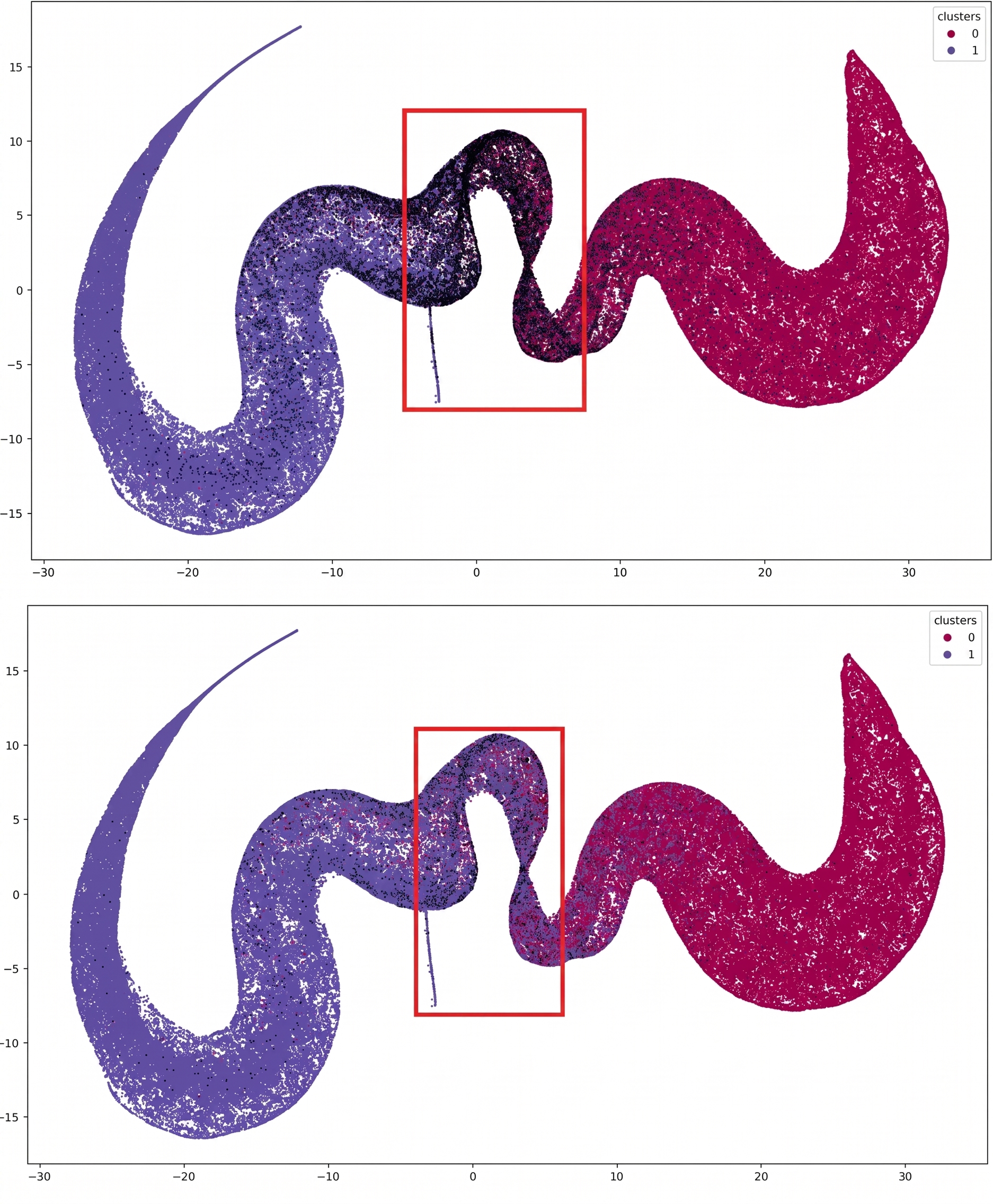
Fig. 8. This image shows a cluster graph of the Breast Cancer dataset training data on the top panel, and the Breast Cancer dataset (Mooney, 2023) testing data on the bottom panel. On the top panel, the region highlighted with a red perimeter shows an area of high density of mistakes in the training data (the data points resulting in mistakes have been colored black). Importantly, the testing data also shows a region of high density of mistakes around the same perimeter, such that if the perimeter identified with the training data is used as an indicator of possible mistakes, most of the mistakes in the testing dataset are identified. (For interpretation of the references to color in this figure legend, the reader is referred to the web version of this article.)
For specific classes that share commonalities, for example cat vs dog, the baseline model has a 10.9 top-1 error rate over the entire test dataset, but the likelihood of a mistake for any given prediction is not evenly distributed over the entire dataset. Visualizing the model’s internal representations and designating mistake indicators based on regions with high density of mistakes lets us designate ‘‘Trusted Regions’’ where the accuracy is high vs ‘‘Ambiguous Regions’’ where the accuracy is much lower. For cats vs dog we can design a ‘‘Trusted region’’ comprising of 85% of the cat/dog population where the accuracy is 95.5% and a region comprising 17% of the cat/dog population where the accuracy is 79.02%. Table 3 shows that using the Squint Pipeline errors are largely eliminated within the trusted region for top 2 and 3 predictions.
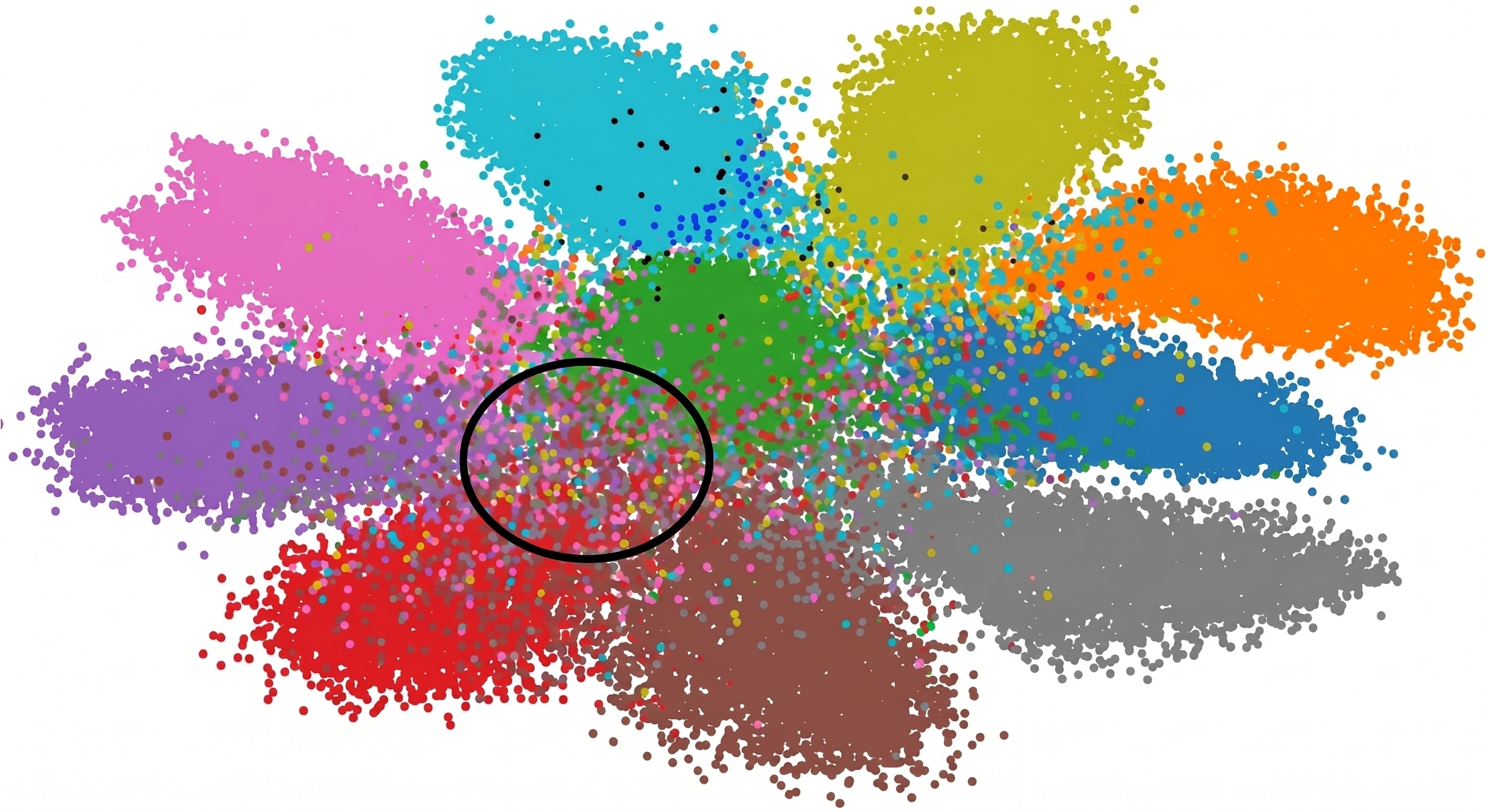
Fig. 9. Cluster analysis of CIFAR-10’s training data as captured by a neural network’s internal representation. The area circled in black points to an example of region overlap.
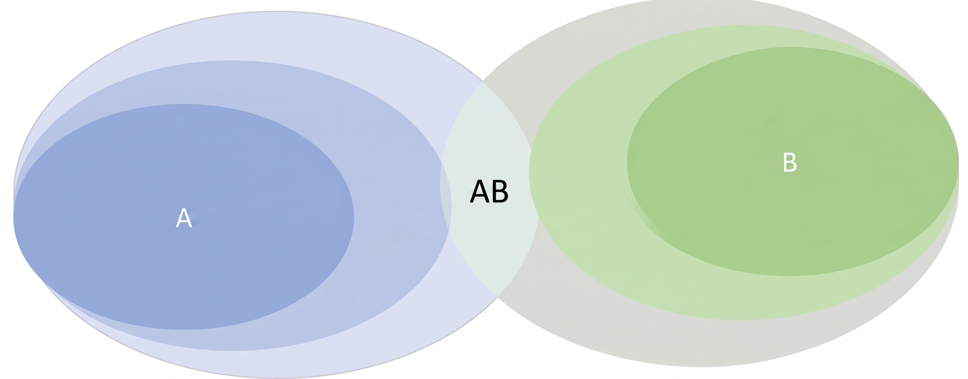
Fig. 10. Cluster 𝐴 and cluster 𝐵 represent a set of images from class 𝐴 and 𝐵. The clusters are darkest where the pairwise similarity score between images in the same class is highest. This figure highlights that in regions where the clusters overlap, such as the area labeled 𝐴𝐵, the pairwise similarity score of images of opposing classes (𝐴𝑎𝑛𝑑𝐵) is higher than the pairwise similarity score of images in this region and the images at the center of their respective clusters. That is, images belonging to class 𝐴 in the 𝐴𝐵 region are more similar to class 𝐵 images than they are to the images at the center of the class 𝐴 cluster. The same is true for images of class 𝐵.

Fig. 11. On the top row of this image we see a picture of a horse from the CIFAR-10 dataset. In the center of the top row is the heatmap produced by the 𝐴𝑣𝑔𝑁𝑜𝑟𝑚 Eq. (6). The image on the right of the top row is the heatmap super-imposed over the picture of the horse. On the bottom row we see the same horse on the left and in the center we have a heatmap produced by the 𝑁𝑜𝑟𝑚𝐴𝑣𝑔 Eq. (7). The image on the right is the heatmap super-imposed over the picture of the horse. The bottom row tells us what the neural network’s prediction is based on. In this case the prediction is mostly based on the front legs of the horse. The top row shows that earlier layers identified other features as important, the tail and part of the ears and face, but that information was lost in the compression.
Even within the ambiguous region the Squint pipeline can reduce the error rate by 85% for the top 2 and 3 predictions.
Table 2
Results of using a squinting pipeline following the methods described in section IV vs state of the art performance of well-known models on the cifar-10 dataset, and a breast cancer dataset. We show that a Squinting Pipeline can improve the performance over the baseline models.The results reported in these experiments were achieved against the test dataset.
Model
Dataset
Top 1 error rate on test dataset
Top 2 error rate on test dataset
Top 3 error rate on test dataset
VGG 16
CIFAR-10
6.87
2.03
0.72
VGG 19
CIFAR-10
5.29
1.45
0.67
ResNet50
CIFAR-10
5.08
1.11
0.36
CNN
Breast cancer
10.63
N/A (binary classification)
N/A (binary classification)
Squint Pipeline
CIFAR-10
4.48
0.91
0.29
Squint Pipeline
Breast cancer
10.04
N/A (binary classification)
N/A (binary classification)
Scroll the table sideways to see all columns.
Table 3
Classes like cat/dog and deer/horse naturally have a blurred boundary where the images blend into each other and are difficult to distinguish at the edge of the distributions. The experiments in this table show that we can designate regions between clusters of cat/dog and deer/horse where mistakes are concentrated as ‘‘ambiguous regions’’, and regions of the clusters with accurate predictions as ‘‘Trusted Regions’’. The results reported in these experiments were achieved against the test dataset.
Model
Dataset
Cat vs Dog Top1 error rate on test dataset
Trusted Region (Top 1 error on test dataset)
Trusted Region (Top 2, 3 error on test dataset)
Ambiguous Region (Top 1 error on test dataset)
Ambiguous Region (Top 2, 3 error on test dataset)
ResNet50
CIFAR-10
10.9
N/A
N/A
N/A
N/A
Squint Pipeline
CIFAR-10
10.4
4.51
0.75, 0
25.63
6.18, 2.55
Deer vs Horse Top 1 error rate
ResNet-50
CIFAR-10
4.15
N/A
N/A
N/A
N/A
Squint Pipeline
CIFAR-10
3.36
1.72
0.73, 0.35
17.5
2.55, 0.73
Scroll the table sideways to see all columns.
Table 4
The Squint Pipeline in this experiment is able to increase overall performance over the baseline model, but more importantly, the division of Trusted vs Ambiguous regions created using the techniques described in section IV are especially useful in medical use cases. We can designate a large portion of the dataset consisting of over 2/3s of the data where the performance of the model is high, and identify a region consisting of 1/3 of the data where a human pathologist can focus their attention. The results reported in these experiments were achieved against the test dataset.
Model
Dataset
Error rate on test dataset
Trusted Region (Error on test dataset)
Ambiguous Region (Error on test dataset)
CNN
Breast cancer
10.63
N/A
N/A
Squint Pipeline
Breast cancer
10.04
4.17
20.98
Scroll the table sideways to see all columns.
The breast cancer dataset experiment used a state-of-the-art model achieving 10.63% error rate on classifying cancer vs normal tissue. Using the methods described in this paper we can generate a squinting pipeline that can improve the overall accuracy on the dataset by 0.59%, but more importantly, we can generate a trusted region comprising 65% of the dataset that achieves 95.83% accuracy, and an ‘‘ambiguous region’’ comprising 35% of the dataset where 75.71% of all mistakes are concentrated. In a production environment using a squinting pipeline we can automate the decisions on the trusted region. This improves the automated performance by 6.1% accuracy which means making 961 fewer mistakes than the baseline model over the entire dataset. For predictions originating from the ambiguous region, a squinting model trained specifically on the data within the ambiguous region automatically improved the accuracy in the region by 1.68% and decreased the number of false negatives by 177. But importantly, for decisions originating in the ambiguous region, the squinting pipeline can generate alerts to involve a human in the loop, for example a pathologist, to further evaluate the decisions. In this case the pathologist is now able to focus on 1∕3 of the data instead of the full dataset.
Fig. 12 describes the performance of the CNN model in Table 4 using an AUC ROC curve. The Y axis represents the True Positive Rate, and the X axis represents the False Positive Rate. The area under the curve is a measure of how well the model is capable of distinguishing between the two data classes (cancer and healthy tissue). The closer this value is to 1 the better the performance of the model. The AUC value for the CNN model is 0.89 with a true positive rate of 0.903 and a false positive rate of 0.115. In the medical domain it is important that beyond just accuracy, we track a model’s performance with respect to the false positive and false negative mistakes they produce. Different use cases might tolerate a higher rate of false positive results as long as false negative mistakes are minimized. True positive rate is calculated as TPR = TPTP + FNwhere TP is True Positive and FN is False Negative.
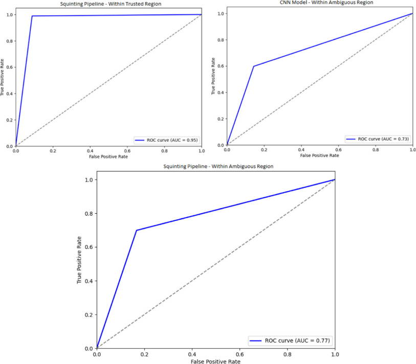
Fig. 13 top left panel reports the performance of the Squinting pipeline within the trusted region. The AUC of the Squinting pipeline within this region is 0.95. The TPR of the Squinting pipeline within this region is 0.989 and the false positive rate is 0.088. This tells us that using our approach we can strategically use the original CNN model from Table 4 within the trusted region to greatly improve the prediction sensitivity (ability to correctly identify positive cases). The top right panel reports the performance of the CNN model within the ambiguous region. The AUC for this region is 0.73 with a True Positive Rate of 0.598 and a false positive rate of 0.145. The bottom panel reports the performance of the Squinting pipeline (using the CNN model trained specifically on the ambiguous region) in the ambiguous region. The AUC of the Squinting model within the ambiguous region is improved to 0.77 compared to 0.73 for the original CNN, and the TPR is improved from 0.598 to 0.699.
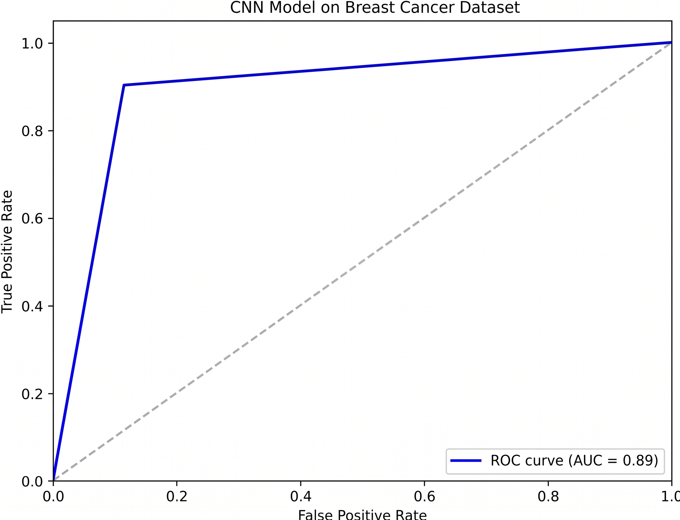
Fig. 12. This image shows the AUC ROC curve for the CNN model trained on breast cancer data, featured on Table 4. The AUC ROC curve shows the relationship between the correct predictions and false positive predictions in the model.
We tested a set of Grad-Cam based heuristics for identifying mistake indicators in the predictions of the baseline model. The heuristics were identified using the methods described in Section 4 for MNIST, CIFAR10, and the breast cancer dataset. In our experiments the Grad-Cam based heuristics were able to flag a large number of mistakes, but the best results were achieved when designing mistake indicators using clustering algorithms t-SNE, and PacMap.
5. Section V
5.1. Future work
So far, we have discussed heuristics-based approaches to creating rules for detecting model mistakes at runtime. In this section, we discuss the possibility of extending the search for mistake indicators beyond heuristics, using a machine learning approach to detecting the likelihood of a mistake in a prediction by a model during production. We can refer to the likelihood 𝑃 (𝑒, 𝐹 |𝑀𝑖𝑠𝑡𝑎𝑘𝑒) in Eq. (2). It might be possible to generate a training dataset of 𝐹 ∈ ℝ𝑑 vectors by selecting the features 𝑓 ∈ ℝ𝐿(𝑥) of the last layer of ℎ(𝑥), as well as features from previous layers following the FPN model approach. The dataset must contain an equal number of 𝐹 vectors with ‘‘correct’’ labels, and 𝐹 vectors with ‘‘mistake’’ labels. We can then train the error-detecting model ℎ𝑚(𝑥) to find the distribution that maximizes the likelihood 𝑃 (𝑒, 𝐹 |𝑀𝑖𝑠𝑡𝑎𝑘𝑒).
In production, for every prediction of model ℎ(𝑥) we can consult ℎ𝑚(𝑥) with a newly formed 𝐹 vector created by extracting the features involved in the prediction and generate a likelihood that the prediction is a mistake. It is important to note that in most cases it should be possible to create a model ℎ𝑚(𝑥) that is orders of magnitude smaller than ℎ(𝑥). That is because ℎ𝑚(𝑥) leverages the feature extracting powers of ℎ(𝑥).
5.2. Discussion
Our main contribution with this paper is a framework that can be built around a production-ready model to improve its robustness and our ability to trust its predictions. As described in Fig. 3 the framework consists of three steps: (1) invoke a state-of-the-art model to make a prediction at production time (2) evaluate the prediction and the state of the model with respect to a compiled list of mistake indicators (3) accept the prediction if no indication of mistake is found, otherwise reject the prediction and either involve a human in the loop, or process the input further with a more specialized algorithm or model. Let us discuss each step in detail with respect to motivation, and limitations of our approach at each step.
The state-of-the-art model used in step 1 represents a model that is ready for deployment in a production environment. A state-of-the-art model in most domains or applications today is likely to be a neural network based algorithm. As stated in Section 1 even state-of-the-art neural networks often make high confidence mistakes, and what is worse, it is difficult to explain the prediction of a neural network with respect to the input to learn why a mistake occurred. The difficulty lies in that a prediction from a neural network is based on a series of non-linear transformations of the input vector towards some separable hyperspace, where the parameters that define the transformations are tuned based on many trials over large training datasets. In this sense, the complexity of neural networks is due to the prediction-making process being different from a discreet set of decisions about the input, rather it can be viewed as a monolithic transformation of the input to a hyperspace that aligns with the training dataset, such that the answer to the question ‘‘Why is the prediction 𝑌̂ given input 𝑋’’ must be given in light of the entire training dataset and the training process.
The purpose of step 2 is to identify mistake indicators that can be automated in a watchdog module to monitor predictions during deployment for signs of mistakes. For this we rely on methodologies from the field of XAI. In this paper we use clustering algorithms t-SNE and PacMap to generate a map of predictions over the entire training dataset and identify regions where correct predictions are concentrated, and regions where mistakes are concentrated. We name those regions Trusted and Ambiguous regions. To generate the clusters we use the internal representation of the training data, that is, we use the data in the final hyperspace after the series of non-linear transformations have been applied. By doing this we are able to compare single predictions against the entire training dataset which was responsible for tuning the transformations. The result is that we can interpret the prediction as a similarity score between the transformed input and all other transformations performed in training. This map can provide a hint of whether the prediction is likely to be a mistake or not depending of where in the map it lies.
There are limits to what we can expect to learn from clustering algorithms. Clustering provides insight on the prediction at the sample level but not at the feature level. That is, it can show how likely a prediction is to be a mistake or not based on how similar the transformed input sample is to other data points in the transformed training dataset. But it cannot explain what features in the sample was most responsible for the prediction. It is also worth noting that algorithms like t-SNE and PacMap are dimensionality reduction algorithms which can suffer from loss of important features in the data. Furthermore, similarity scores in generated maps of trusted and ambiguous regions should be treated as guidelines for similarity over regions on the map, rather than as specific measurements of similarity between datapoints. This is because algorithms like t-SNE are not great at maintaining the high dimensional global structure in the low dimensional space. Nevertheless, if the training dataset is a good representative sample of the data the model will encounter in production, our experiments show that we can use the map of trusted and ambiguous regions generated using clustering algorithms to make accurate predictions on whether the model is making a mistake or not. The accuracy and usefulness of the map naturally depends on how representative the dataset is, because identifying locations where mistakes are concentrated is only useful if we have enough data points to accurately cover all regions where mistakes are likely to concentrate.
To explain predictions at the feature level in this paper we rely on Grad-Cam, which can generate a saliency map identifying features of the input most important to the prediction. Looking for indications of good features leading to correct predictions, and low quality features leading to incorrect predictions, can be useful for generating mistake indicators that can be used in deployment, but these indicators lack the contextual information present in the clustering methods. For example, Ambiguous regions are useful beyond just identifying mistakes. Ambiguous regions can suggest that there are different ways to interpret the input such that even if the prediction is correct according to the label, two different humans might disagree on the label itself. This level of contextual information cannot be retrieved from saliency maps. Thus, we should consider the task of identifying mistake indicators one where we rely on many XAI algorithms, each revealing important information in the prediction-making process of a model, rather than a race to find an optimal one.